Ember & Tide, 2026
Ember & Tide
Wood fired, sea inspired fine dining experience.
Introduction
Ember & Tide is a fine dining restaurant celebrating the relationship between fire, sea and craftsmanship. Rooted in seasonal British seafood and open-flame cooking, the brand is built around the belief that exceptional dining begins long before a dish reaches the table.
The challenge was to create an identity that captured this philosophy without relying on familiar fine dining clichés. Instead, the aim was to craft a visual world that reflected the restaurant’s respect for provenance, tradition and the artistry behind every ingredient. Beyond creating a memorable identity, the project sought to position EMBER & TIDE as a destination restaurant- one capable of commanding premium pricing, attracting discerning diners and building long-term brand recognition through a cohesive customer experience.
Overview
The identity takes its inspiration from nineteenth-century British fishmongers’ trade ephemera, where beautifully printed wrappers, merchant marks and illustrated seafood celebrated quality, provenance and craft. These historical artefacts became the foundation of the visual language, bringing a sense of cultural richness and authenticity to a contemporary hospitality brand.
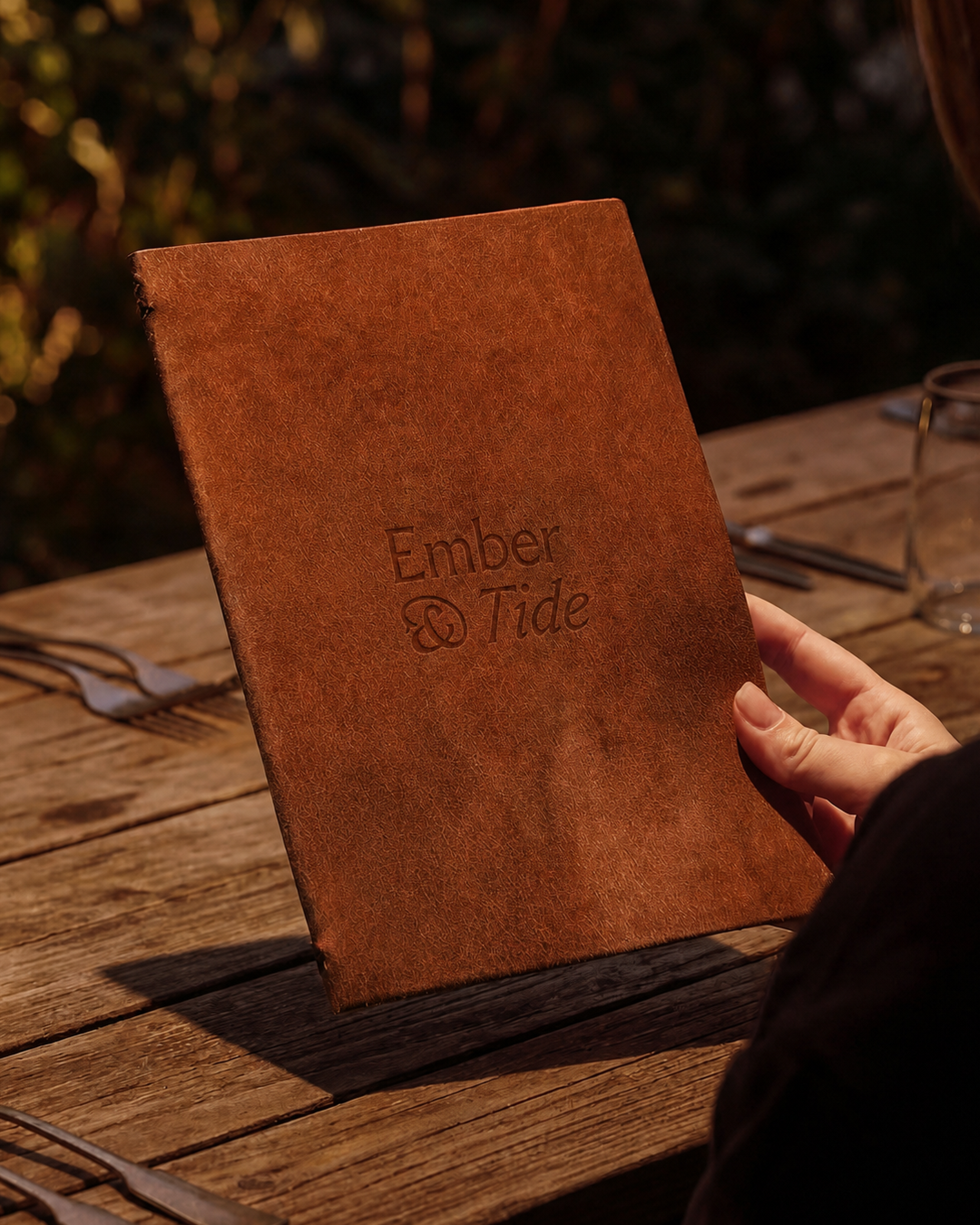
This influence is carried most clearly through the logo. A refined slab serif wordmark introduces a modern sense of confidence, while the ampersand is directly inspired by the typography found on historic fishmongers’ wrappers. Reimagined as the brand mark, its tail subtly transforms into the silhouette of a fish tail - a quiet reference to Ember & Tide’s seafood-led cuisine and the heritage that inspired it.
The colour palette was drawn from the very elements that define the restaurant itself. Deep ocean blues, warm ember reds, soft shell tones and charcoal blacks reflect the relationship between sea and fire, creating a visual language that feels tactile, atmospheric and timeless.
A key part of the creative direction explored the connection between nature and craft. The flowing grain within fish, the movement of ocean currents, the markings left by open flames and the textures found in natural ingredients all share an unexpected visual rhythm. These parallels became a recurring graphic language throughout the identity, reinforcing the idea that cooking is not separate from nature, but an extension of it. This sense of connectivity became a defining feature of the brand, creating an experience that feels grounded, immersive and deeply respectful of the environment from which it’s ingredients are sourced.
Outcome
The final identity captures the atmosphere of Ember & Tide through a carefully art-directed visual system that feels premium, sophisticated and inviting. Every element works together to express the restaurant’s values, allowing the brand to communicate it’s story before a guest even sits down at the table.
A series of hand-drawn illustrations, inspired by the variety and naturally of the food, were created before being scanned and vectorised for use across menus, signage, printed collateral and social media. These handcrafted details introduce warmth and authenticity, balancing the refined typography with a distinctly human touch.
Beyond creating a beautiful visual identity, the brand was designed to deliver tangible business value. A cohesive and distinctive identity helps position Ember & Tide within the premium dining market, attracting guests who seek memorable culinary experiences rather than simply a meal. By creating a recognisable and immersive brand world, the restaurant can build stronger customer loyalty, encourage repeat visits and generate greater word-of-mouth and social sharing- essential drivers of growth within the hospitality industry.
The considered branding also supports premium menu pricing by reinforcing perceptions of quality, craftsmanship and attention to detail at every customer touchpoint. From the first impression online to the final course at the table, the identity creates confidence, elevates the perceived value of the experience and provides a flexible visual system that can grow across future campaigns, seasonal menus, merchandise and additional locations.
More than a logo, Ember & Tide is a complete brand world- one that honours the traditions of the past while presenting them through a contemporary lens. It celebrates provenance, craftsmanship and exceptional dining, creating an identity as thoughtfully composed as the food it represents.