Ampersand Brewery, 2025
Ampersand Brewery
Brand and packaging design balancing quiet storytelling with product-driven execution for UK distribution.
Introduction
Ampersand Brewery is a conceptual label design exploring how storytelling and illustration can elevate a product within a competitive craft beer market. The project translates a narrative rooted in natural connection into a considered, commercially aware packaging system, designed to sit confidently within real-world retail environments.
Research and concept
The Approach
The concept is inspired by the quiet complexity of long-term bonds found in nature, with research revealing that over 35,000 animal species - particularly birds - form lifelong partnerships. Rather than relying on traditional or overt romantic symbolism, the design takes a more observational approach, using illustration to subtly reference these enduring connections in a way that feels organic and understated.
This idea of quiet partnership became the foundation for the visual narrative, shaping a label system that communicates warmth, connection, and depth without feeling illustrative in an overly literal sense. The aim was to create a story that enhances the product, rather than overpowering it.
Visual Identity
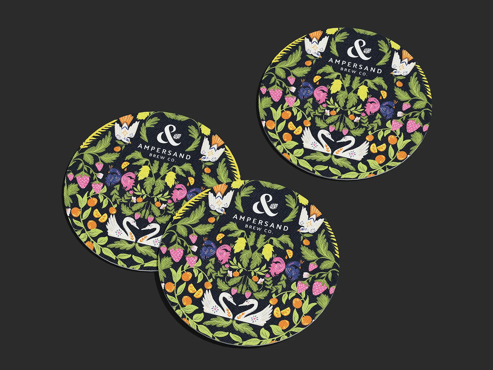
The visual language is closely informed by the characteristics of the beer itself. The colour palette draws directly from the Citra and Strata hops used in the brew, layered with soft, natural tones that reference subtle strawberry notes within the flavour profile.
Illustration plays a central role in the identity, introducing a more expressive and narrative-led layer to the packaging. The forms remain detailed yet restrained, allowing the storytelling to sit comfortably alongside the product information and branding hierarchy.
Typography and layout were designed to balance clarity with character, ensuring the labels remain functional while still feeling distinctive within a crowded shelf environment.
Illustration & Craft Details
Illustration was used to gently visualise the idea of connection in nature, focusing on form, rhythm, and interaction rather than direct representation. The artwork introduces a sense of narrative depth, encouraging closer inspection while maintaining a calm and refined visual tone.
This layer of craft helps bridge the gap between storytelling and product design, giving the label a more memorable and ownable presence.
The Outcome
The final identity demonstrates how conceptual storytelling can be translated into a commercially viable packaging system. By grounding the design in both product characteristics and narrative insight, Ampersand Brewery becomes more than a label — it becomes a subtle expression of connection, craft, and care within the context of modern beer branding.