Loop, 2025
Loop
A mindful rail identity focused on reducing commuter stress through rhythm, clarity, and calm.
Introduction
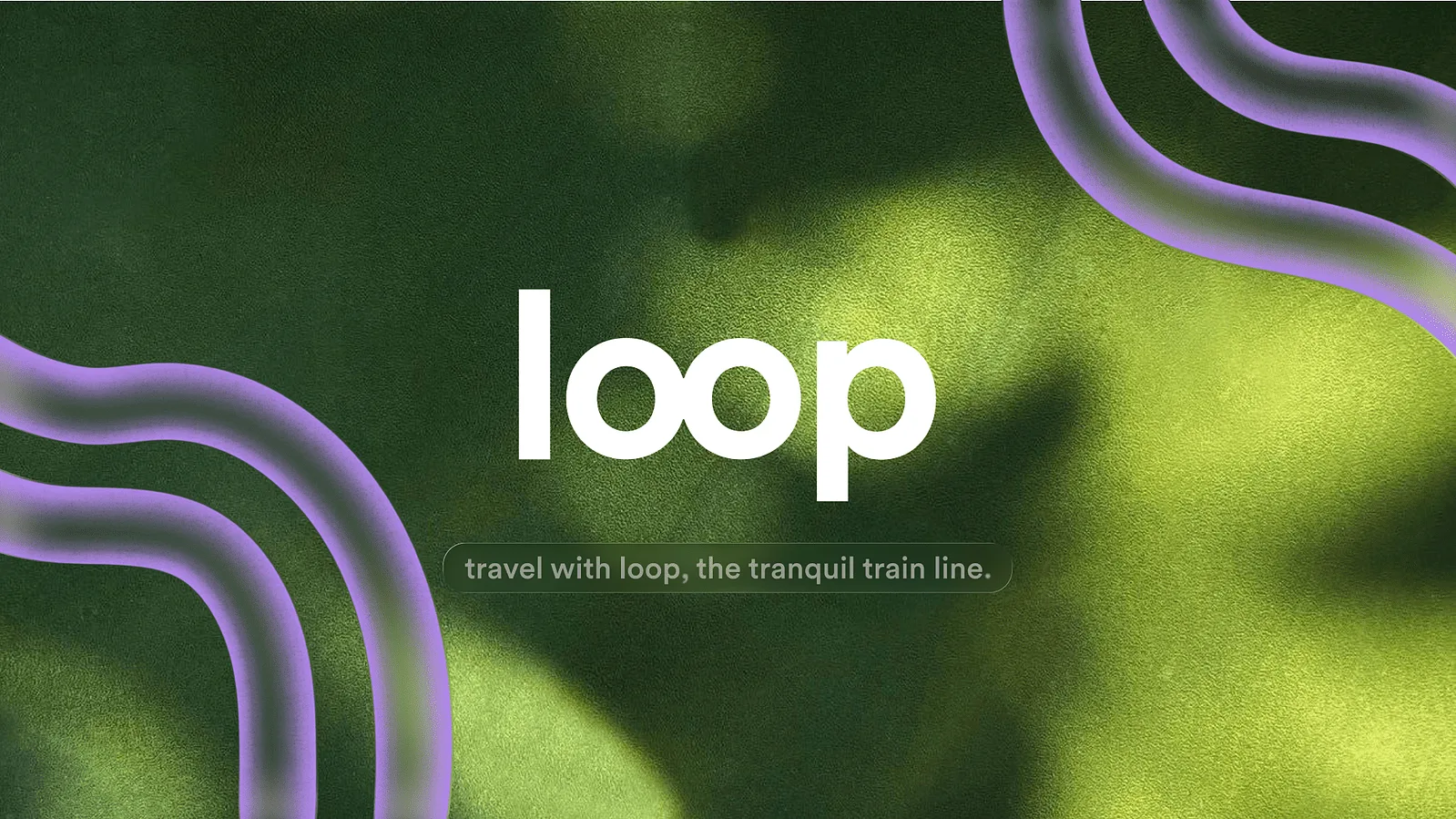
Loop is a conceptual brand identity for an everyday rail service designed to reduce the stress often associated with commuting and reframe travel as a more mindful experience. Created in response to the growing pressures of modern daily travel, the project explores how branding and visual environments can positively influence emotional wellbeing within public transport spaces.
With nearly half of commuters reporting rail travel as stressful, alongside a significant lack of mindfulness practices amongst adults, Loop brings these two challenges together through a more considered and human-centred approach to travel.
Overview
The Approach
The creative direction for Loop was rooted in the idea that small and often overlooked details can significantly shape how we experience a space emotionally. Research explored the quiet visual parallels between train tracks and Zen gardens - both defined by rhythm, repetition, symmetry, and flow.
This connection informed a visual identity that balances industrial structure with a softer and more calming visual language. Rather than following the often functional and rigid aesthetics associated with transport branding, Loop aimed to create a more atmospheric and emotionally aware experience for commuters.
The brand positions everyday travel not simply as a necessity, but as an opportunity for pause, clarity, and calm within increasingly fast-paced daily routines.
Visual Identity
Linear forms became a core element of the identity system, inspired by the repetitive geometry found within both railway infrastructure and meditative landscapes. These structured elements were softened through grainy textures, muted contrasts, and blurred visual treatments to create a sense of movement, stillness, and transition simultaneously.
The colour palette and typography were selected to feel understated yet reassuring, supporting the wider intention of creating a calmer and more approachable transport experience. Across applications, the identity system was designed to move seamlessly through signage, printed materials, digital interfaces, and environmental graphics.
Illustration & Craft Details
Texture and atmosphere played an important role throughout the project, helping introduce a more tactile and sensory quality to the visual identity. Subtle visual distortions and layered graphic elements were used to evoke motion and rhythm, reinforcing the idea of travel as a flowing and restorative experience rather than a purely functional one.